Positioning / Floating : Images move When Browser Moves
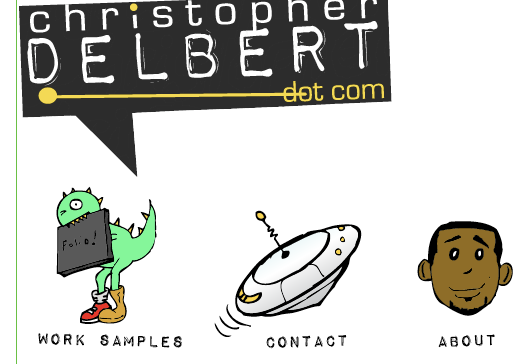
I’m working on redesigning my website attempting a 100% CSS Design. My first site I just used dreamweaver and frames. I having a few issues. My mock up looks like this:

I’ve been able to line up the images with positioning, but when ever I maximize the screen all 3 of them flow to the far right and are no longer centered.
Also if I grab the screen from the bottom, the buttons stay put, but the logo goes flying away. I set all images on the page to Fixed. I thought Fixed stopped in the images from moving, I originally had them at absolute positioning but the same thing happened.
I have no idea what I’m doing wrong. To summarize my problems are as follows:
- Getting my images to stay put, no matter how I move/resize the browser window.
- Getting my images to stay centered in the middle of page, in both the maximized and normal viewing of the browser.
- Centering an images in a row without tables.
Here is my xhtml
<head>

<link href="stylesheet.css" rel="stylesheet" type="text/css"/>
<title> Christopher DELBERT dot com FREE CREATIVITY </title>

</head>
<body>

<div id= "site">
<p id= "logo"><img src="logo/main-logo.gif" alt="logo" width= ""/></p>


<div id= "navigation1">
<ul><li class= "worksamplesaur"><img src="MainMenuButtons/worksamplesaur-hover.gif" width="200" height="274" /></li>
<li class="saucer"><img src="MainMenuButtons/contactsaucer-hover.gif" /> </li>
<li class="info"><img src="MainMenuButtons/info-hover.gif" /></li>
</ul>
</div>

<div id= "navigation2">
<ul><li class= "worksamples"><img src="MainMenuButtons/worksamples-preclick.gif" /></li>
<li class= "contact"><img src="MainMenuButtons/contact-preclick.gif" /> </li>
<li class= "about"> <img src="MainMenuButtons/about-preclick.gif" /></li>
</ul>
</div>

</div>


</body> </html>
and my CSS
body {

background-color: white;
}


/* Logo */
#logo{

margin: 0;
position: fixed ;
text-align: center;
bottom: 25.2em;


}


/* Menu Bar */
#navigation1 ul {
list-style:none;
margin: 0;
padding-left: 0em;
padding-top:1em;
text-align: center;
overflow: hidden;
}

#navigation1 li {
display: block;
margin-left: auto;
margin-right: auto ;

}

#navigation2 ul {
list-style:none;
margin: 0;
padding-left: 0em;
padding-top:1em;
text-align: center;
overflow: hidden;
display: block;
margin-left: auto;
margin-right: auto ;
}

#navigation2 li {
display: inline;
text-align: center;
display: block;
margin-left: auto;
margin-right: auto ;


}


/* Menu Bar  Pictures*/

.worksamplesaur{
position: fixed;
right: 47em;
left: 25  em;
top: 23em;
text-align: center;
padding: ;
display: block;
margin-left: auto;
margin-right: auto ;


}

.saucer{
position: fixed;
right: 22em;
top: 23em;
display: block;
margin-left: auto;
margin-right: auto ;

}


.info{
position: fixed;
right: 4.5em;
left:  em;
top: 26em;
text-align: center;
padding: ;
display: block;
margin-left: auto;
margin-right: auto ;
}


/* Menu Bar Words */

.worksamples{
position: fixed;
right: 45em;
left: 25  em;
top: 43em;
text-align: center;
padding: ;
display: block;
margin-left: auto;
margin-right: auto ;

}
.about{
position: fixed;
right: 7em;
left:  em;
top: 43em;
text-align: center;
padding: ;
display: block;
margin-left: auto;
margin-right: auto ;

}

.contact{
position:fixed;
right: 25em;
top: 43em;
display: block;
margin-left: auto;
margin-right: auto ;
padding: ;

}

.site{
position:fixed;

}
webwiz posted this at 18:03 — 20th October 2009.
He has: 629 posts
Joined: May 2007
Using "position: fixed;" fixes an element within the browser window (except in older IE, which does not understand "fixed".) I don't think that's what you want. From your code, it looks like you are attempting an elastic ("em" based) layout, but it's hard to tell from this snippet, especially as I don't know the sizes of your images.
Here's an example that works with different image sizes and a variable number of images. It may be overkill for your needs, but it is very flexible:
http://www.brunildo.org/test/ImgThumbIBL.html
You can omit the @media stuff at the end of the
<style>block - Opera these days is fine with the rest of the code.For other (simpler?) ideas, I suggest putting your attempt on the Web so we can see the actual images and layout.
Cordially, David
--
delete from internet where user_agent="MSIE" and version < 8;
Want to join the discussion? Create an account or log in if you already have one. Joining is fast, free and painless! We’ll even whisk you back here when you’ve finished.